Load CSS Asynchronously
This article explains FOUC (Flash of unstyled content), render-blocking issues, and how to load CSS asynchronously.
Flash of unstyled content
After the HTML is loaded, it will be displayed first, and then the CSS will be loaded. You will see the HTML screen without style first, and might load CSS style in short time. This causes it looks like a flicker. In addition to this situation, many webpages now also use JavaScript to render the screen, and similar problems will also occur.
例如一個使用 Bootstrap 的頁面放入一個按鈕
For example, puts a button in a page using Bootstrap.
1 | <a class="btn btn-primary" href="https://www.google.com/">Google</a> |
If FOUC occurs, there will be a moment to see
The correct result will be seen after the style is loaded
Render-Blocking
In order to avoid the above situation, the browser uses render-blocking. It will start rendering the page after loading some rendering-blocking resources. CSS is one of the render-blocking resources, and the browser’s behavior is to start rendering after the style files are loaded. The above example would be the following result:
When the CSS is not loaded, you may see that the page is loading. The page will not display.![]()
When the CSS is loaded, you can see the styled page directly.
Load CSS Asynchronously
Why
Render-blocking may have solved the FOUC problem, but it seems to create new one. Assuming that the CSS is very large or the network is slow, the likely page takes a long time to display, or it may not even display at all. In addition, when using SEO analyzer such as PageSpeed, this will have a big impact on the scores of FCP (First Contentful Paint) and LCP (Largest Contentful Paint). So using an asynchronous way to load CSS has become a solution.
How
Before asynchronously, let’s take a look at the general synchronous loading method:
1 | <link rel="stylesheet" href="https://cdn.jsdelivr.net/npm/[email protected]/dist/css/bootstrap.min.css"> |
There are several common ways to achieve asynchronous
- Use rel=”preload”
- Use media=”print”
- Use JavaScript
Use rel=”preload”
Change to
1 | <link rel="preload" href="https://cdn.jsdelivr.net/npm/[email protected]/dist/css/bootstrap.min.css" as="style" onload="this.onload=null;this.rel='stylesheet'"> |
The principle is to use the JavaScript onload event to replace it with a stylesheet. To avoid browsers that do not support JavaScript, and we add the noscript part. Note that if you want to set media in this way, you need to set it in onload, otherwise it will not load:
1 | <link rel="preload" href="print.css" as="style" onload="this.onload=null;this.rel='stylesheet';this.media='print'"> |
Use media=”print”
Change to
1 | <link rel="stylesheet" href="https://cdn.jsdelivr.net/npm/[email protected]/dist/css/bootstrap.min.css" media="print" onload="this.media='all'"> |
The principle is to use JavaScript onload event to change the condition to a displayable type. Media print is applied when printing, so it will not take effect when entering the webpage normally. Except print can be used directly, the others are written in onload.
1 | <link rel="stylesheet" href="print.css" media="print"> |
Use JavaScript
You can use the library loadCss or write it by yourself, and add it after the page is loaded:
1 | const link = document.createElement('link'); |
Comparison
The difference between the first two is not big, generally speaking, the browser compatibility of preload is relatively poor. It is recommended to use the second method. However, using JavaScript to load is quite different from the first two. The main difference is the timing of loading files.
Use media=”print”
1 | <link rel="stylesheet" href="https://cdn.jsdelivr.net/npm/[email protected]/dist/css/bootstrap.min.css"> |
The loading sequence is as follows. It will start loading the file first after HTML parsed.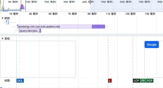
Use JavaScript
1 | <link rel="stylesheet" href="https://cdn.jsdelivr.net/npm/[email protected]/dist/css/bootstrap.min.css"> |
The loading sequence is as follows. It will start loading files after onload.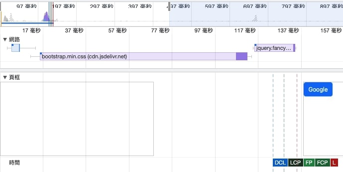
When
However, if you directly apply the above asynchronous loading method, you will find that… the FOUC problem happend. Because avoiding rendering blocking is equivalent to back to the beginning, and the FOUC problem will also backk. In fact, not all problems can be solved by changing to asynchronous without thinking. There is a prerequisite for using asynchronous loading CSS: only defer non-critical CSS. For example, the website uses some libraries like fancybox, which cannot be seen at first.
In most cases, the second method is sufficient. However, in practice, sometimes there are too many non-critical files. When downloading at the same time, the loading of the critical CSS is affected by the network bandwidth problem. For example, the following simulation:
In this case, we can use JavaScript to avoid
Split File
After understanding the above principles, we know that non-critical CSS should use asynchronous loading, so we have to split the files. For example, originally saved as one file:
1 | <link rel="stylesheet" href="all.css"> |
May be split into multiple files
1 | <link rel="stylesheet" href="main.css"> |


